Designing a Startup Bank
Overview
Brief Design the onboarding process for an app-only startup bank in Greece
Duration 12 Weeks
Project Team Members 3x Product Designers, 2x Brand Designers, Development Team, 1x Product Manager
My Involvement Client workshops, competitor analysis and benchmarking, sketching, wireframing, user testing, high fidelity design
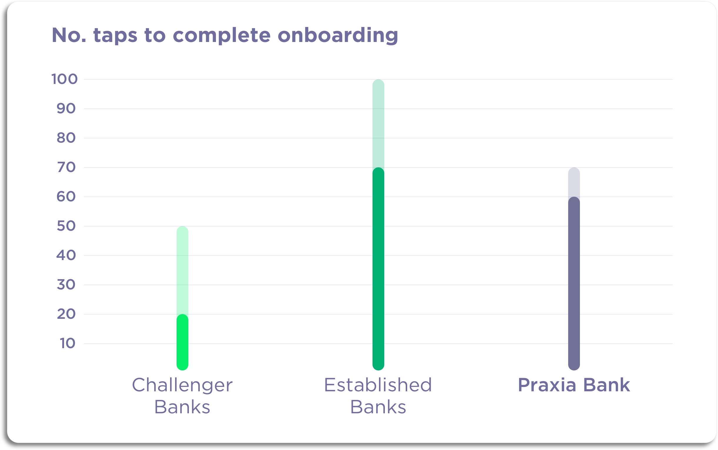
Result The onboarding process I designed was significantly quicker than those of the established Greek banks (60–70 taps vs. 70–100) and that could be completed entirely in-app, a first for a Greek bank
Background
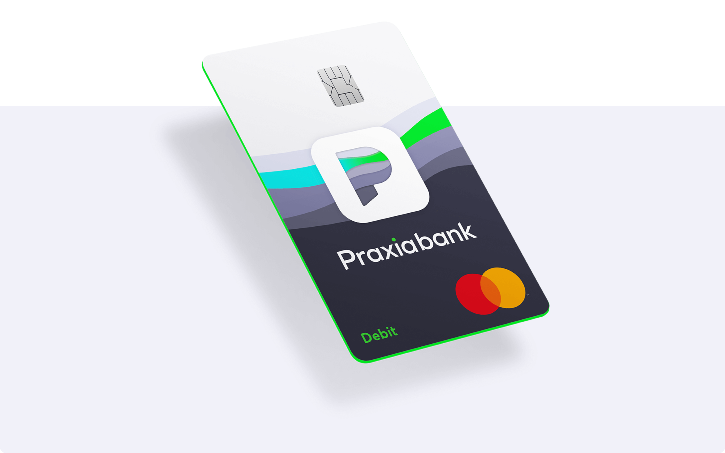
Praxia, a Greek startup, were looking to create the country’s first app-based bank. At the time, opening a bank account with one of the country’s established banks involved users printing forms, posting them back and sometimes even going into a branch. Praxia wanted to change this by navigating the challenging regulatory environment and creating a seamless digital experience, which focused on 21-30 year olds initially.

My Role
When I joined the project, the team had already carried out discovery research and the Information Architecture had been created and tested. This gave us a high level understanding of the structure of the app and allowed us to divide the sections of the app between the four designers working on the project. I was tasked with designing the onboarding journey. This included the experience if a user were to download the app directly from an app store and if they came to the app via the marketing website. It was crucial that I got this experience right as having an app that was difficult to sign up for would affect not just the uptake of the product but the trajectory of the company as a whole.
Competitor Analysis
I analysed the onboarding journeys of the leading Greek banks and the European Fintech challenger banks. I wanted to understand what it would need to be able to do to convince people to use it over others. I was particularly interested in how they solved the problem of verifying people’s identities and complying with the necessary KYC/AML checks without the onboarding experience suffering.
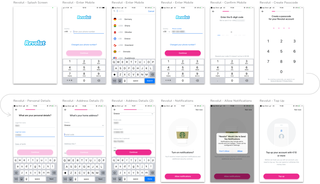
I also audited how many taps it took to complete each onboarding process so I had a benchmark when designing ours (inspired by Built For Mars). The app-only challenger banks took between 20–50 taps to complete onboarding, whilst the established banks took between 70–100 (and had some offline component as well.) Since we had no brand recognition as we were pre-launch, our experience would have to be as compelling as possible to compete. Designing the app to be quicker and easier to sign up to than the established banks would be my way of contributing to this.

Approach to User Research
I worked with the research team to understand the user research which had been carried out before I joined the project. The team had conducted interviews with our target user groups for the MVP - tech savvy university students and young professionals between 21–30 years old. The insights from this research informed both the requirements for the product and our sense of our users’ general attitudes, needs from the app, and the context in which they’d be using it.
As we already had discovery research, I decided to focus on validating the designs through testing rather than carrying out more up-front research.
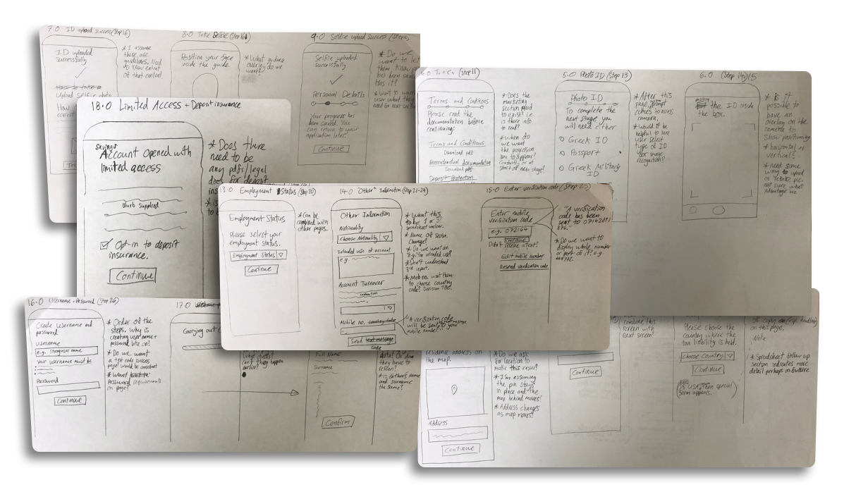
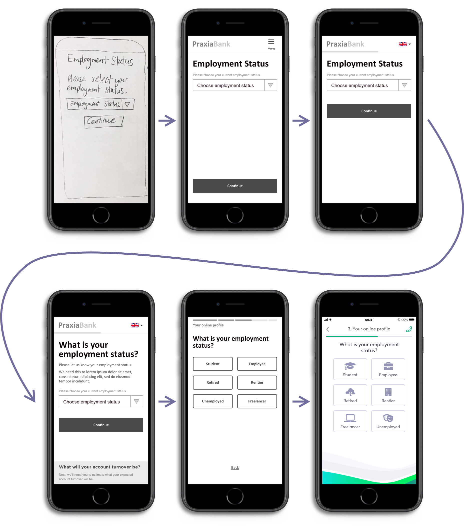
Streamlining the Onboarding
My first step was to take the business requirements for the onboarding and scrutinise whether each one was needed. Knowing that speed of completion would be the key metric for this journey, I worked with the business to move some steps to after the onboarding was finished and removed others entirely. Once I had a streamlined list, I began grouping the requirements into sections, which would form the initial structure of the journey.
Concept Development
My hypothesis for the onboarding was that having more steps with less information in each step would help users complete the process quicker, as they would be able to build up momentum if each step placed less cognitive load on them. This is in contrast to having fewer steps, with more information in each step. Early testing confirmed this was mostly correct and showed that users were getting lost more easily on longer, more demanding pages.
My guiding principle whilst designing was, as my old boss Chris Thelwell used to say, ‘the fidelity of the designs should reflect the fidelity of the thinking.’ Following this would hopefully mean that I’d get feedback on the right aspects of the design from developers and stakeholders and also that large-scale changes wouldn’t be as time-consuming to react to. I kept my designs in low fidelity for longer than I would have ordinarily to deal with uncertainty surrounding the back end systems, which led to a lot of change.
Managing Uncertainty
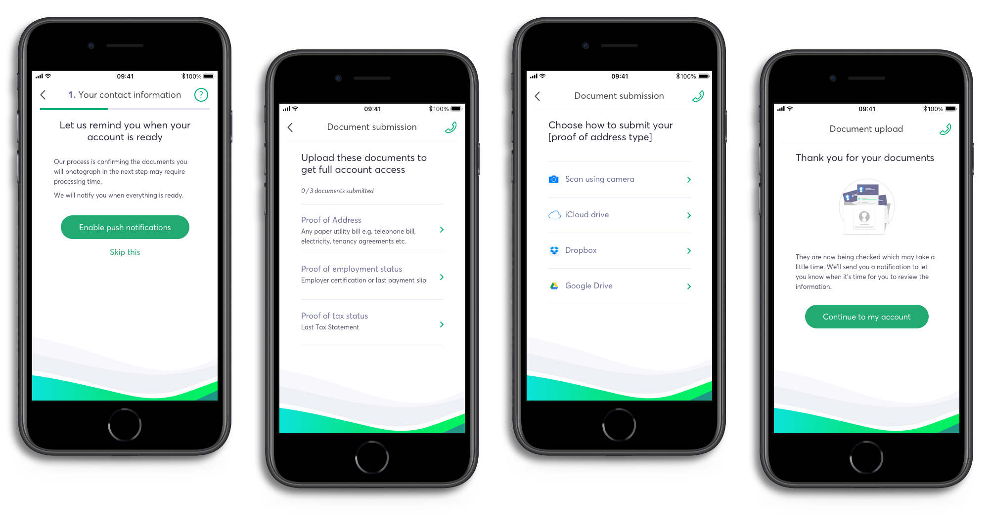
We were designing whilst lots of technical and regulatory questions were still up in the air, which meant there was a need to be able to adapt to changing circumstances quickly. For example, there was a chance that the regulator would refuse to authorise our solution for digitising the offline, form-filling processes. To work around this, we designed a version of the onboarding journey which had an offline component.
Another source of uncertainty was how long the ID scan and checks would take. The vendor predicted it would take between 20 seconds and 10 minutes (and occasionally longer) to extract and analyse the information. To design for this uncertainty, I decided to encourage the user to drop off and to re-engage them with a notification when the checks were finished to avoid them waiting and becoming frustrated.
Working with the Development Team
As I was responsible for not just designing the journey but also ensuring it could actually be built, I spent a lot of time working with the development team representing our users in discussions about when to use out-of-the-box functionality and when to build things from scratch. We were deciding when to prioritise speed of build versus quality of user experience.
I also created a process map for the onboarding journey which showed the potential error states and unhappy paths for a user. This was used by developers and stakeholders to ensure as many different scenarios as possible were designed and planned for.
Guerrilla Testing
To validate my designs and ensure they were easy to use and communicated the messages that we needed, I carried out ‘guerrilla’ testing in a nearby café. A café would be perfect as they’re often quite busy and chaotic, which would help simulate a typical environment in which someone might use our app, unlike the more sanitised environment of a testing lab. Our client was based near a university, which meant I had a ready supply of users from our target market to test with (as long as I bought the coffee!)
The testing involved me sitting next to the participant, setting the scene for them and taking notes whilst they tried to complete the process, with me asking clarifying questions when they did or mentioned something unexpected.
One notable insight from testing was that users felt the hyper-streamlined version of the onboarding was disorientating. In an attempt to help users move through the flow quickly, I had gone too far and made it confusing by removing context. To remedy this, I added in more signposting to help signal to users where they were in the flow and give context for why we were asking for different pieces of information.
I tested the onboarding flow at different stages throughout the design process and at different levels of fidelity. Finally, we settled on a design that users found easy to use and the client felt satisfied their goals.
The Results
At the end of the eight weeks, I delivered the high fidelity onboarding journey to the developers, ready for build. I got the number of taps to complete the onboarding down to between 60–70, compared to 70–100 for the established banks and 20–50 for the challenger banks, even though there was the additional regulatory burden on my users in the Greek market.
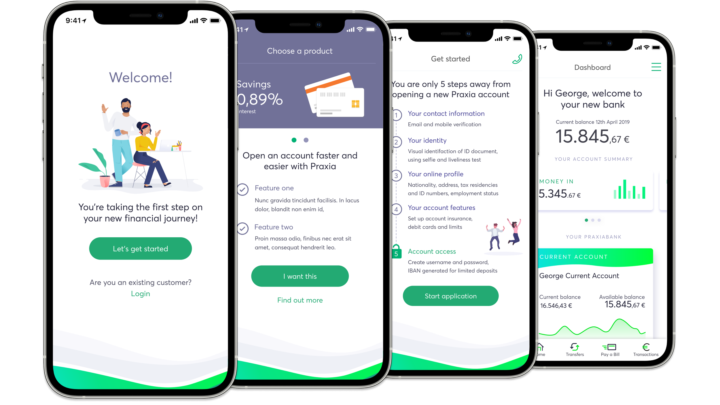
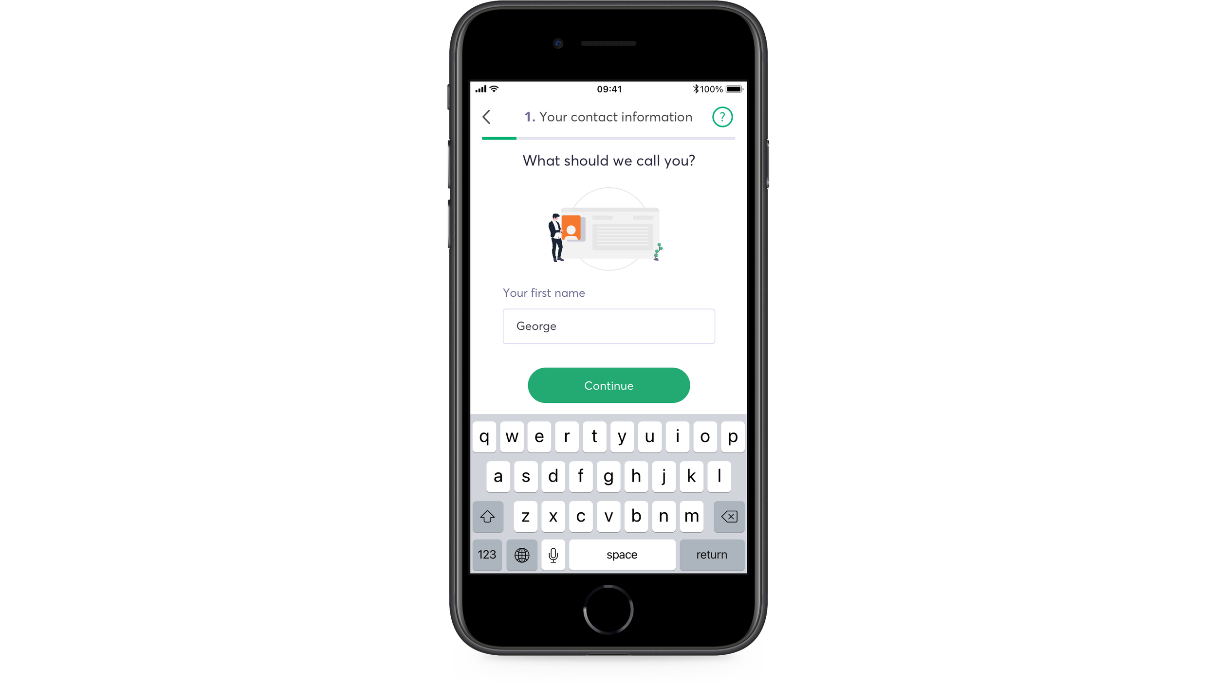
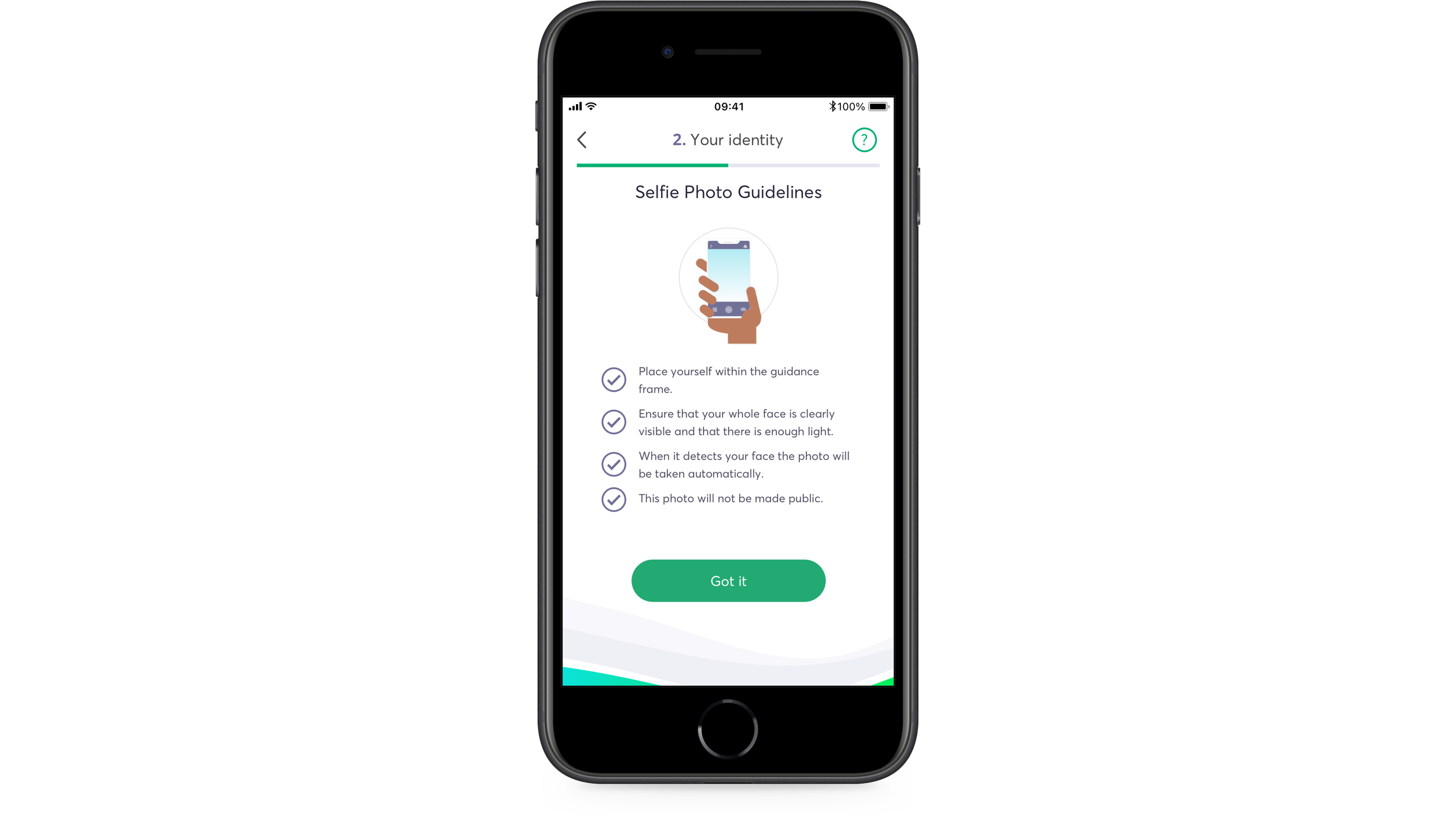
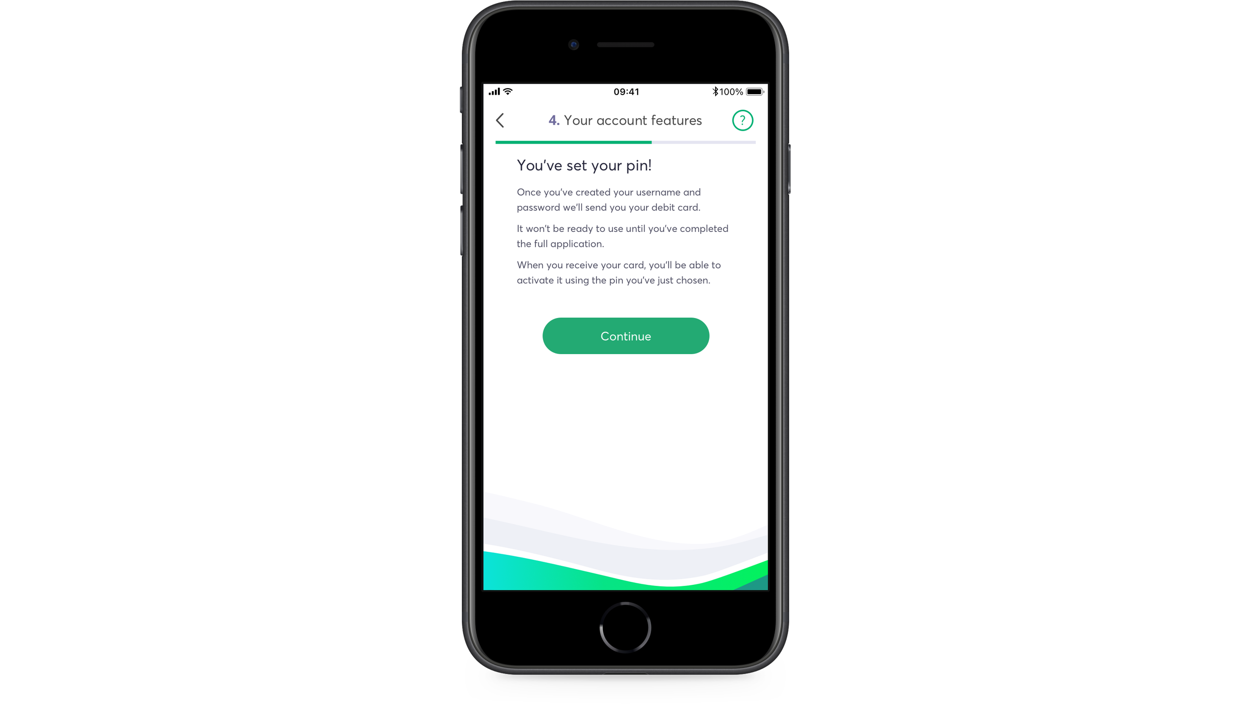
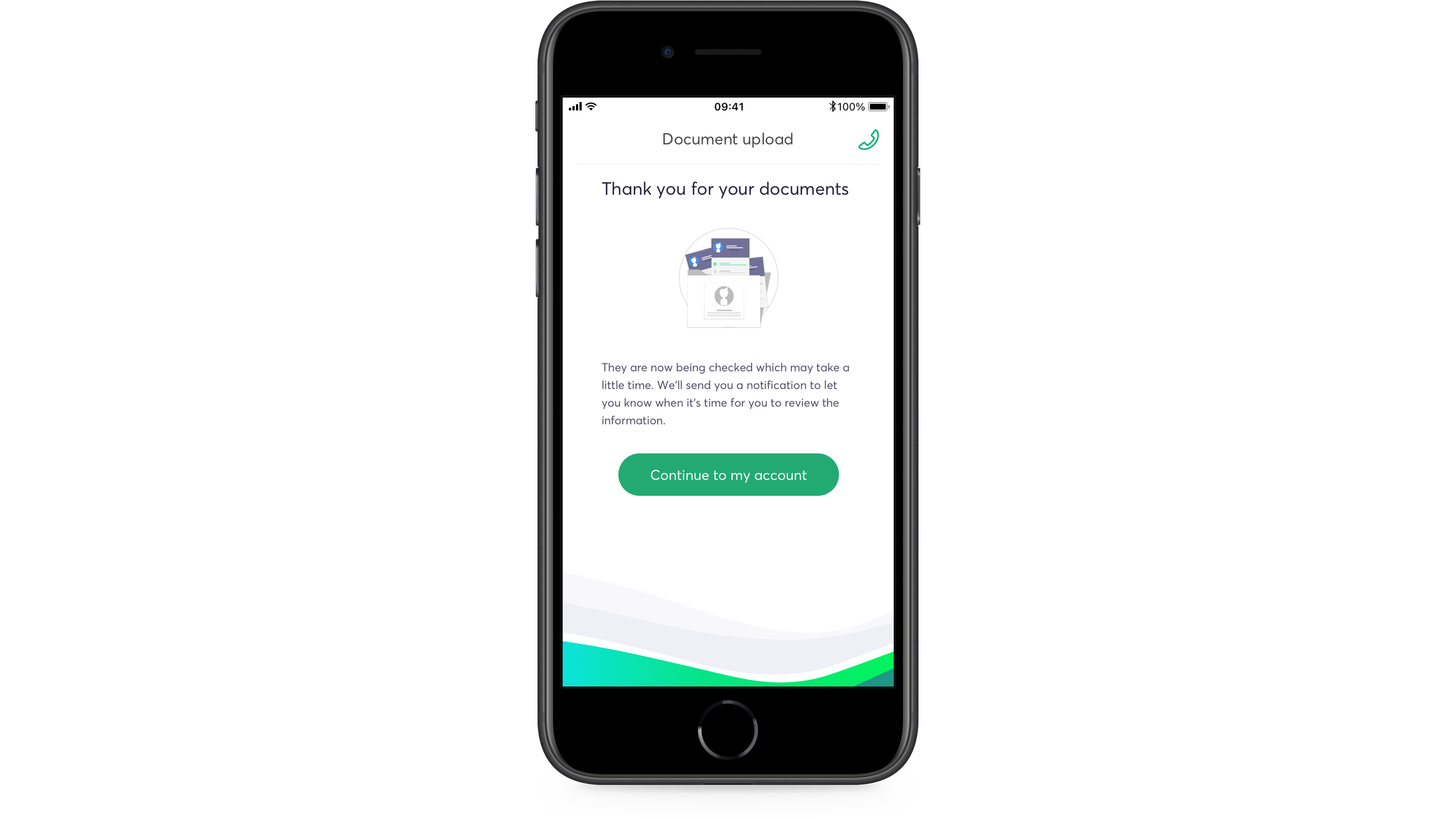
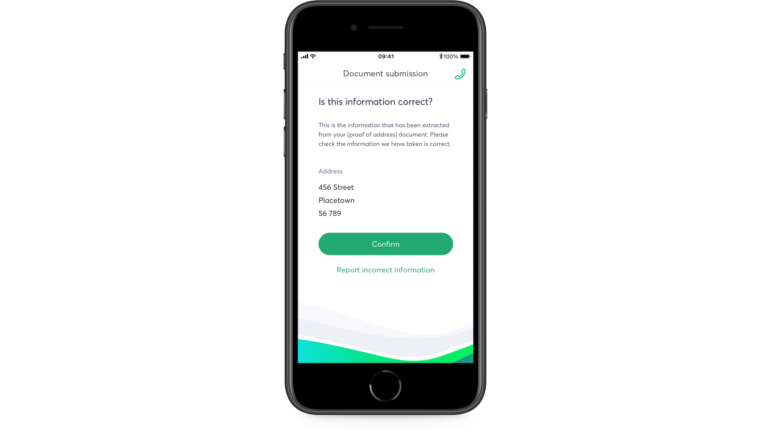
Final Screens


Reflections
If I’d carried on working on the project after the app launched, I’d have proposed three next steps:
Interviews — Calling/interviewing users who had recently finished the onboarding once the app was live, to understand how they found the process and learn how it could be improved.
Analytics — Reviewing analytics data to see where the points were in the flow that caused people to drop off and not complete the sign-up.
A/B Testing — Working with the development team to test different orders of the flow to see which had a higher completion rate.
Overall, I felt that my final design balanced speed of completion with clarity of communication to get users through the journey successfully and all done completely in-app — a first for a Greek bank.